The Tagpeak
Experience Redesigned

The Tagpeak
Experience Redesigned

Tagpeak’s mission is to help people save money on online purchases by partnering with big brands like Samsung, Sephora, and Booking. Their platform reinvests cashback earnings into the stock market, allowing users to potentially get up to 100% of their purchase price back. Despite their innovative model, their existing platform wasn’t delivering. Users found it overwhelming and difficult to navigate, resulting in missed opportunities to engage and retain their audience.

Tagpeak’s mission is to help people save money on online purchases by partnering with big brands like Samsung, Sephora, and Booking. Their platform reinvests cashback earnings into the stock market, allowing users to potentially get up to 100% of their purchase price back. Despite their innovative model, their existing platform wasn’t delivering. Users found it overwhelming and difficult to navigate, resulting in missed opportunities to engage and retain their audience.

Problem

When Tagpeak approached me, their ask was simple yet challenging: make the platform modern, intuitive, and easy to use for their audience—people aged 28 and above who are time-conscious and eager to save.

Outcome

I redesigned Tagpeak’s platform with a clear, intuitive interface, streamlining navigation and simplifying key actions like cashback tracking and withdrawals, ensuring users could easily engage and benefit from its offerings.

Role

Product Designer

Timeline

2 Weeks

Final design

Final design

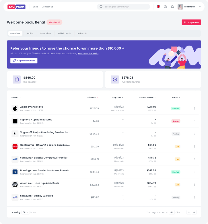
By focusing on clarity and usability, the design I got ensures users can effortlessly engage with the platform, unlocking its full potential to save and earn.

By focusing on clarity and usability, the design I got ensures users can effortlessly engage with the platform, unlocking its full potential to save and earn.

1.0.0 - New dashboard

1.0.0 - New dashboard

1.0.0 - New dashboard

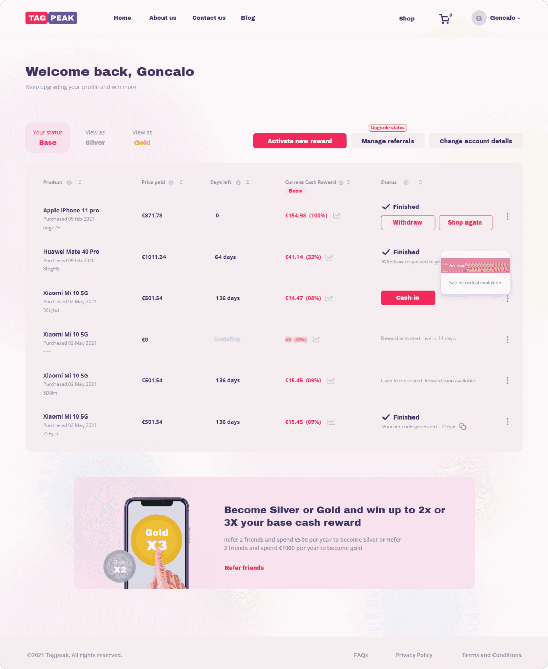
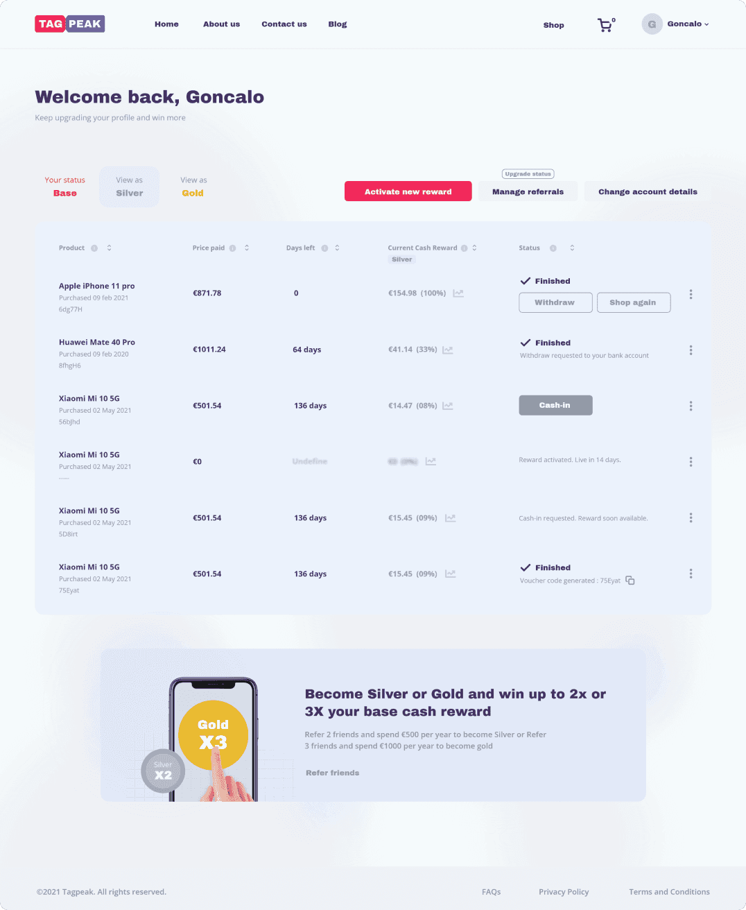
Problem: The usability hurdles

Problem: The usability hurdles

After a quick Heuristic evaluation, and a short user testing, it was clear that Tagpeak’s platform faced significant usability hurdles. 


Tagpeak needed a platform that simplified the user journey, clearly communicated its value, and encouraged users to engage deeply with the service.

After a quick Heuristic evaluation, and a short user testing, it was clear that Tagpeak’s platform faced significant usability hurdles. 


Tagpeak needed a platform that simplified the user journey, clearly communicated its value, and encouraged users to engage deeply with the service.

01

01

Overloaded Dashboard

Overloaded Dashboard

Users were greeted with a cluttered interface packed with buttons and unclear elements, making navigation frustrating.

02

02

Unclear Actions

Unclear Actions

Buttons like “Upgrade Status” were misleading, and the role of other interactive elements was difficult to understand.

03

03

User Confusion

User Confusion

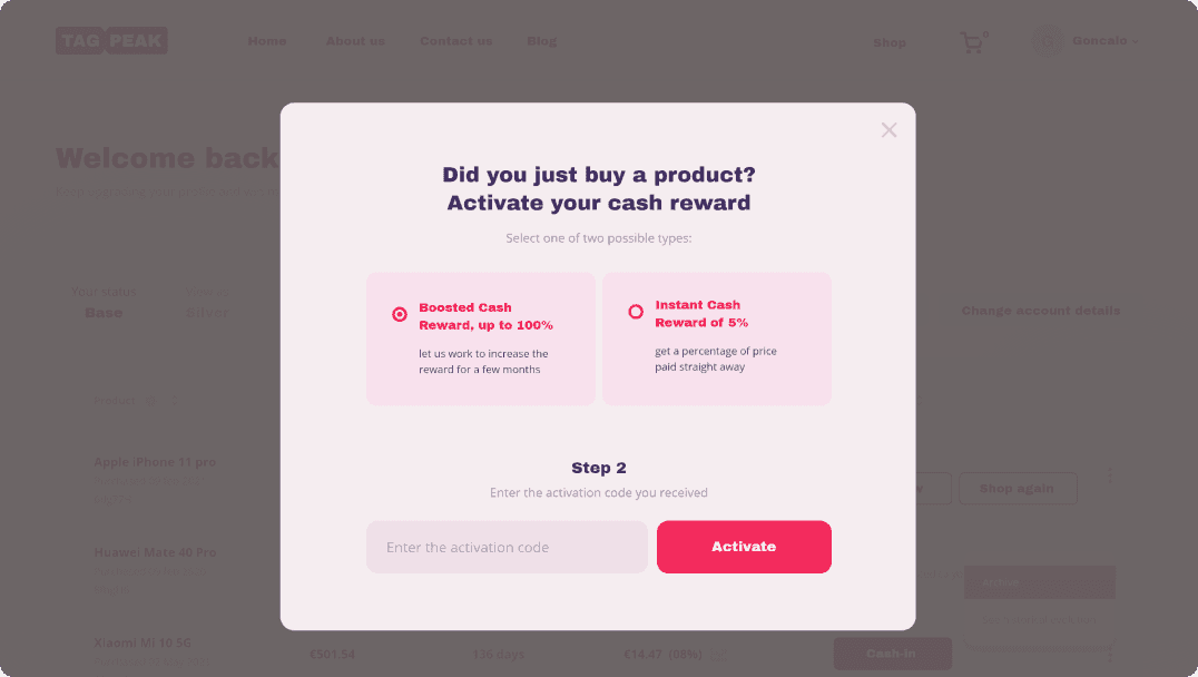
Quick usability testing with three potential users revealed major pain points, including uncertainty about how cashback worked and where to redeem codes.

04

04

Inefficient Navigation

Inefficient Navigation

Users struggled to perform key tasks, such as managing referrals or withdrawing funds, without unnecessary effort.

1.0.1 - Old dashboard

1.0.1 - Old dashboard

1.0.1 - Old dashboard

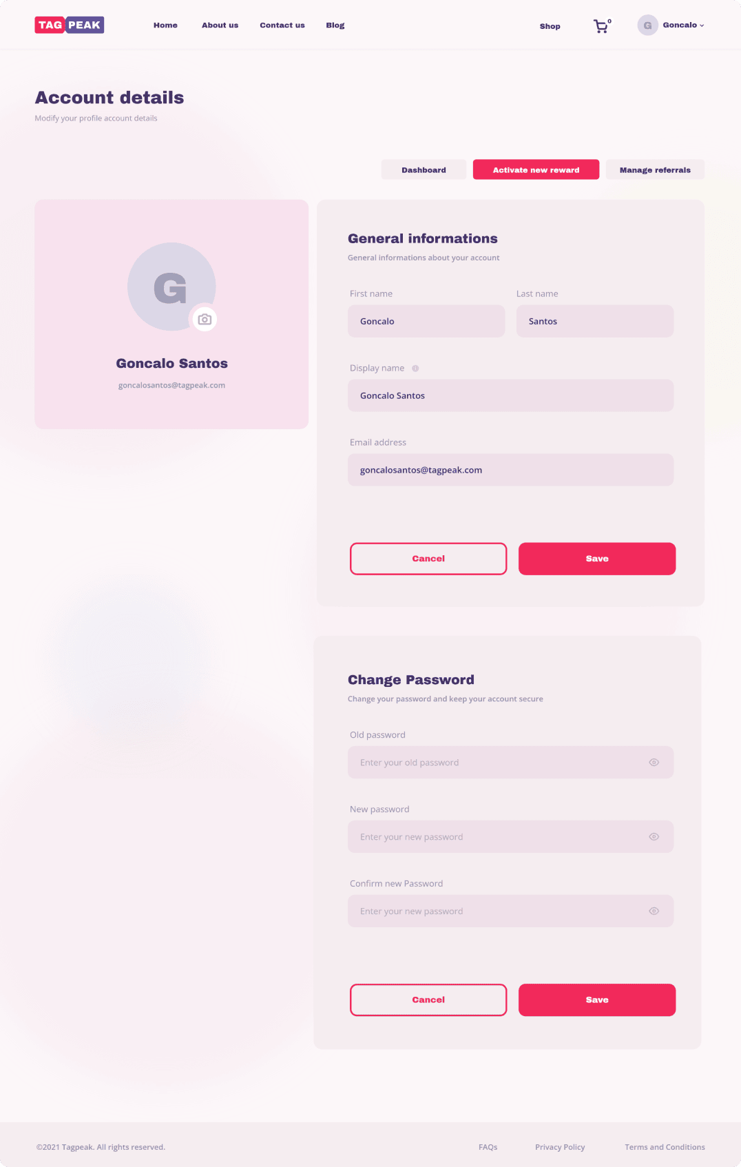
1.0.2 - Old profile

1.0.2 - Old profile

1.0.2 - Old profile

1.0.3 - Old popup

1.0.3 - Old popup

1.0.3 - Old popup

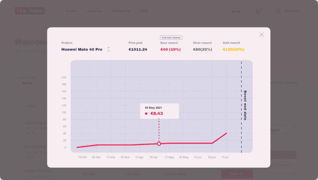
1.0.4 - Product detail

1.0.4 - Product detail

1.0.4 - Product detail

1.0.5 - Old dashboard: silver

1.0.5 - Old dashboard: silver

1.0.5 - Old dashboard: silver

The Solution

The Solution

The after uncovering all the deep usability issues and due to the time constraints, my goals shifted to just getting something better in terms of experience. However, the result obtain was a platform that was not only intuitive but also visually appealing and efficient.

The after uncovering all the deep usability issues and due to the time constraints, my goals shifted to just getting something better in terms of experience. However, the result obtain was a platform that was not only intuitive but also visually appealing and efficient.

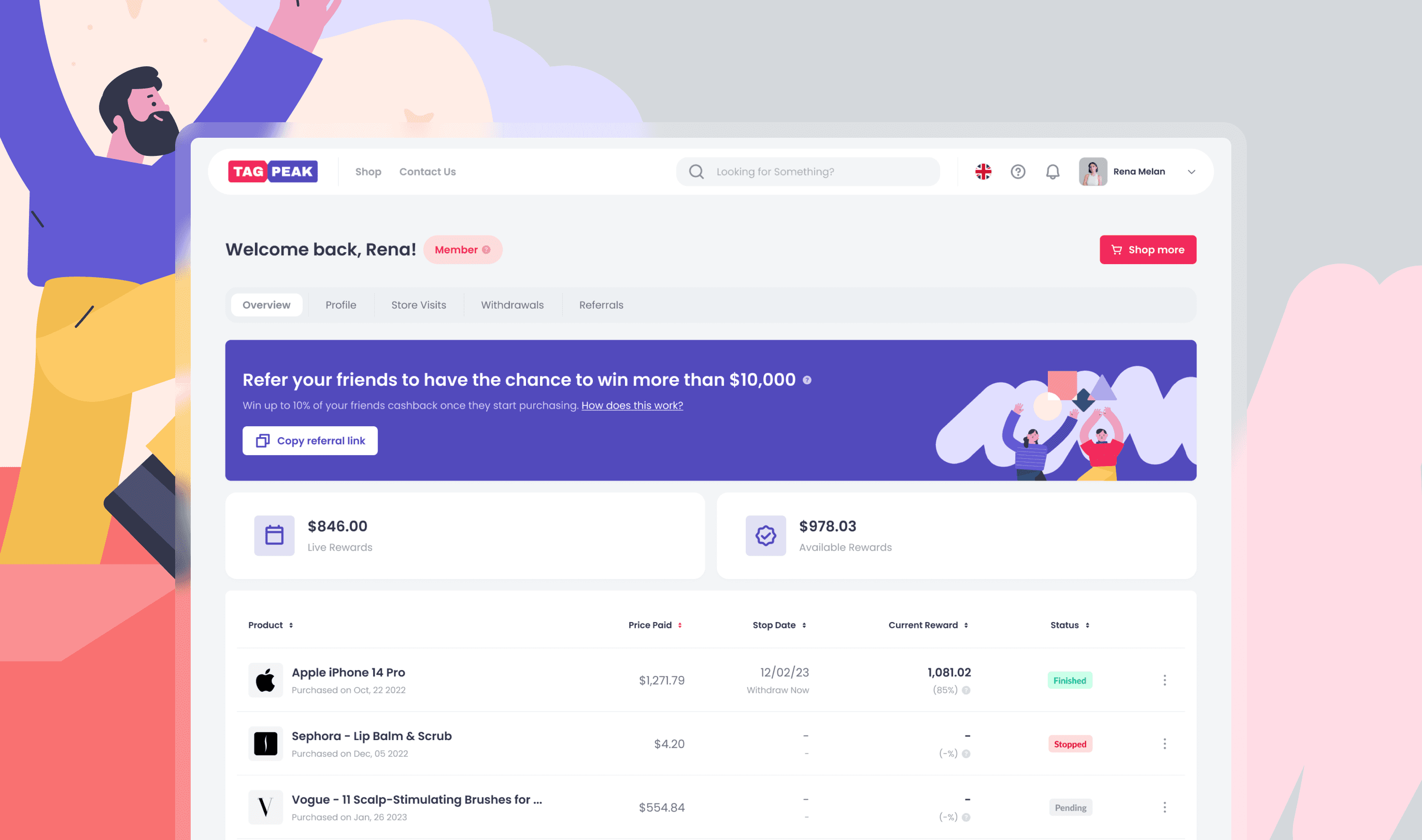
1.0.6 - New Dashboard

1.0.6 - New Dashboard

1.0.6 - New Dashboard

Streamlined the Dashboard

Streamlined the Dashboard

Streamlined the Dashboard

Organized the layout to prioritize key actions, reducing clutter and confusion.

Simplified navigation with clear labels and prominent, intuitive buttons.

Highlighted primary goals like “Upgrade Status” and referral rewards with thoughtful visual hierarchy.

Simplified
Core Features

Simplified Core Features

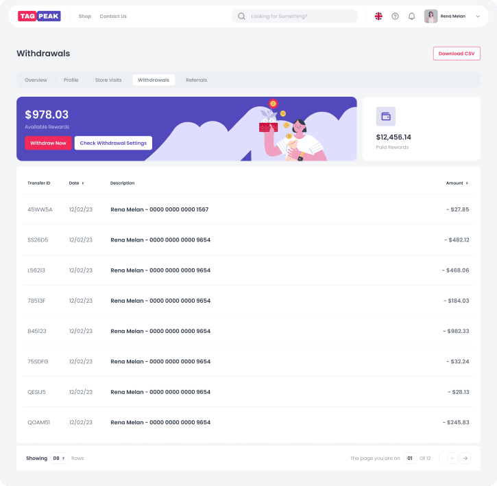
Withdrawals

Designed a 3-click process to let users cash out effortlessly.

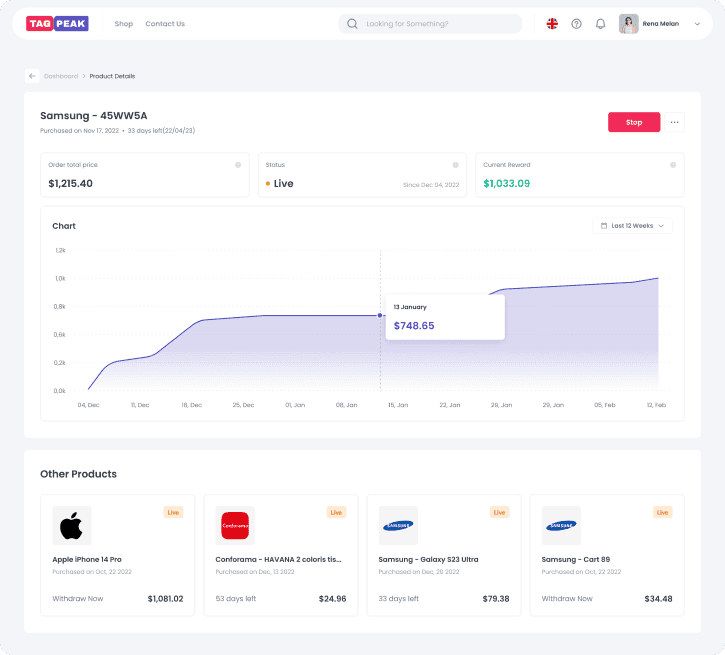
Product Details

Redesigned this page to show purchase history, cashback progression, and a clear “stop” button for claiming cashback.

Referrals

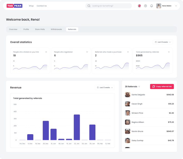
Refined the referral page to highlight potential rewards and simplify sharing options.

1.0.7 - Withdrawals

1.0.7 - Withdrawals

1.0.7 - Withdrawals

1.0.8 - Product details

1.0.8 - Product details

1.0.8 - Product details

1.0.9 - Referals

1.0.9 - Referals

1.0.9 - Referals

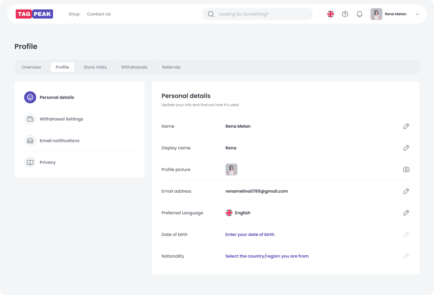
1.1.0 - Profile

1.1.0 - Profile

1.1.0 - Profile

User-Centric Design Enhancements

User-Centric Design Enhancements

User-Centric Design Enhancements

Improved the readability and accessibility of information across all pages.

Added clear explanations for unfamiliar concepts, ensuring first-time users didn’t feel lost.

Established a modern, consistent design system that reflected Tagpeak’s innovative identity.

Key Learnings

Key Learnings

01

01

Simplicity Drives Engagement

Simplicity Drives Engagement

Overwhelming users with excessive elements can hinder their ability to focus on the platform's value. By decluttering and prioritizing key actions, we made the interface more approachable and engaging.

02

02

Prioritize Clarity for New Users

Prioritize Clarity for New Users

First-time users need clear, intuitive guidance. By addressing confusion around core features (like cashback tracking and withdrawals), we created a smoother onboarding process that helps users understand and trust the platform.

03

03

Iterate with a Focus on Business Goals

Iterate with a Focus on Business Goals

While user needs are critical, business goals must also drive design. Highlighting actions like “Upgrade Status” and making referrals prominent aligned user actions with revenue opportunities.

Next Project
Crafting Elegance for Sherman Concierge

Crafting Elegance for Sherman Concierge

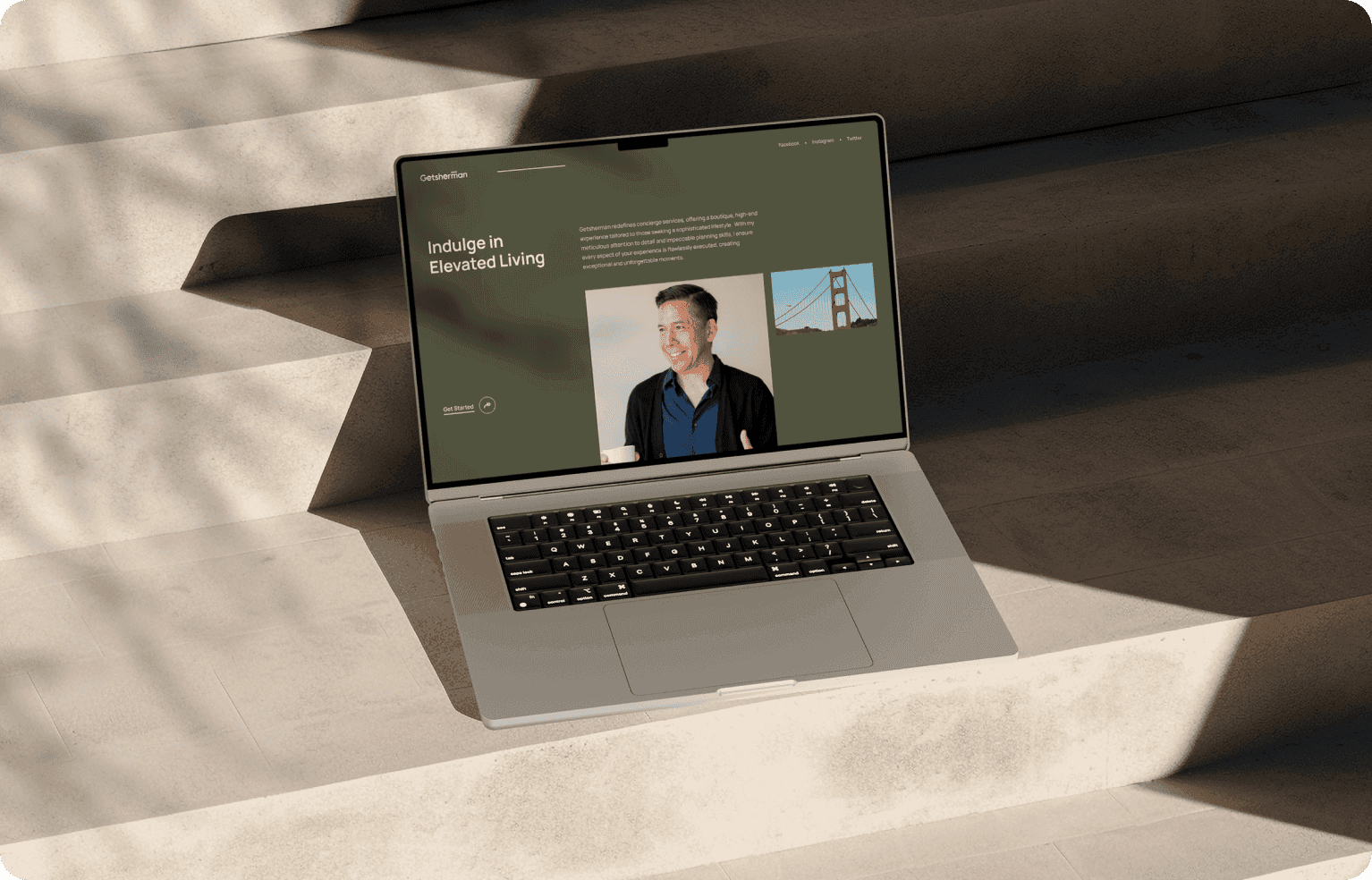
Sherman needed a website that appealed to his target audience: sophisticated families and high-class individuals. The challenge was to create a platform that communicated his services…

Sherman needed a website that appealed to his target audience: sophisticated families and high-class individuals. The challenge was to create a platform that communicated his services…

©️ 2024 Giovanibmingana - All Rights Reserved